
React Charts Made Easy

Create your own beautiful and functional React Heatmap Chart—in less than 50 lines of code, including the imports and component boilerplate!
When you’ve got a lot of data that your users need to parse, the best thing you can do is format it in a way that easily helps them see patterns, dependencies and find insights. Nine times out of 10, that means data visualizations. With the KendoReact UI component library, you don’t have to hunt down yet another external library and wonder if that will have all the various charts, graphs and displays you need—you already have everything you need.
Check out the companion video, React Charts Made Easy
Whether you’re new to writing React or just new to the KendoReact Charts library, we’re going to talk through everything you need to know to make beautiful, interactive data visualizations efficiently—with the help of KendoReact. We’ll start with an overview of what chart types you can use, check out the installation and configuration process and finally see how to apply some common customizations. Let’s get started!
What’s Included?
The KendoReact Charts library includes 16 different types of data visualizations, all made entirely in React with no third-party dependencies:
- Area Chart
- Bar Chart
- Box Plot Chart
- Bubble Chart
- Bullet Chart
- Donut Chart
- Funnel Chart
- Heatmap Chart
- Line Chart
- Pie Chart
- Polar Chart
- Radar Chart
- Range Area Chart
- Range Bar Chart
- Scatter Plot and Scatter Line Charts
- Sparkline
- Stock Chart
- Waterfall Chart
Every single one of these charts has interactivity baked right in: panning, zooming, scrolling, tooltips, and more. Each React chart can be rendered as either an SVG or a Canvas element, as well as easily exported to various image formats (including PDF).
Note: In addition to the above list (which are all part of the Charts library—and our focus in this article), you can also access more complex data visualization options. These have been split into their own sub-libraries within KendoReact so you can reduce bundle size by not including large components that you don’t need:
- Data Grid
- Pivot Grid
- Gantt Chart
- TaskBoard
- Map
- Gauges (including Arc, Circular, Linear and Radial Gauges)
Installing and Configuring the Chart
All KendoReact packages are available through npm. If you’re starting a completely new project, I highly recommend using the Create KendoReact App tool as it is the easiest way to start with KendoReact. It provides a setup wizard that guides you through the process of creating a new React application with KendoReact components. If you already have a React project, then adding the KendoReact Charts is as easy as:
npm install --save @progress/kendo-react-charts @progress/kendo-drawing @progress/kendo-react-intl @progress/kendo-licensing hammerjsCopy and paste that line into your terminal to install the Charts library, as well as the libraries it depends on.
Once you’re installed, it’s time to start setting up the chart. As an example, let’s walk through the steps I took to import and configure the React Heatmap Chart I’m using in my LKARS demo app. Here’s a sneak peek at the finished product:
1. Import the React Chart and Data
We’ve got to get all the pieces into our application before we can start playing with them, so the first step is importing! The React Chart component has several subcomponents that we’ll need: ChartTitle, ChartSeries, etc. You
might need different subcomponents for different series types, so always makes sure to check the documentation if you’re having trouble getting something to work—you might just be missing a subcomponent! In our case, we need the subcomponents
for the ChartSeries and ChartAxises, so our import will look like this:
import { Chart, ChartSeries, ChartSeriesItem, ChartXAxis, ChartXAxisItem, ChartYAxis, ChartYAxisItem, } from "@progress/kendo-react-charts";I’ve also got a separate file, heatmap-data.js, that has all the data we’re going to use in the chart—so I’ll import that as well.
import { data } from "./heatmap-data";2. Set Up the React Chart
Now that we’ve got everything imported, time to put it to use. We’ll start with our parent component. My heatmap fits into a larger grid layout with other components, so I added some styles that tell it to take up 100% of the available width and 80% of the available height of its parent element. You can leave these out, if you like, and it will default to being full size.
<Chart style={{ width: "100%", height: "80%"}}></Chart>3. Specify the Series Type and Connect the Data
Next, we’ll use the and subcomponents to set up the specifics of our chart and wire up the data source.
<Chart style={{ width: "100%", height: "80%"}}>
    <ChartSeries>
        <ChartSeriesItem type="heatmap" data={data} color="#7788ff"/>
    </ChartSeries>
</Chart>
In <ChartSeriesItem> I’m defining the type of chart I want to use as the heatmap with type="heatmap". If you wanted to use a bar chart, pie chart or anything else, this is where you’d specify that. Then, I’m
telling it to use the data I imported to populate the chart with data={data}. Finally, I want my heatmap to match the rest of my LKARS theme, so I’ve specified a hex color for it to use with color="#7788ff". If you
don’t specify a color, it will default to either the KendoReact Default Theme or whichever swatch you’re using.
This is really all I’d need to do to get my heatmap up and running! As you can see below, the data is being imported and everything is working as expected. However, there are a couple more tweaks that I’d like to make, to customize the look and feel of my chart.
4. Customizing the React Heatmap Chart
The first thing I’d like to do is remove the label numbers in each square marker. I’d like my heatmap to focus more on communicating high-level, general trends, so the numbers aren’t important—not to mention, they make it look
cluttered. So, I’m going to add labels={{visible: false}} to my properties and remove those number labels.
<Chart style={{ width: "100%", height: "80%"}}>
  <ChartSeries>
    <ChartSeriesItem type="heatmap" data={data} color="#7788ff"
      labels={{ visible: false }}
    />
  </ChartSeries>
</Chart> 
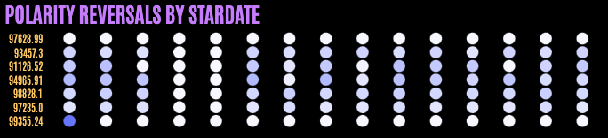
That looks much cleaner! But, in the LKARS style, things are usually round, not square. So, I’d like to change the shape of my markers to better suit the theme by adding markers={{type: "circle"}}. I’ll also give them a border with a 2px width, so they have a little breathing room.
<Chart style={{ width: "100%", height: "80%"}}>
  <ChartSeries>
    <ChartSeriesItem type="heatmap" data={data} color="#7788ff"
      labels={{ visible: false }}
      markers={{ type: "circle", border: { width: 2} }}
    />
  </ChartSeries>
</Chart>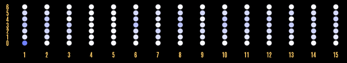
We’re close, now, to how I’d like it to look—but I want to change the axis labels to be more descriptive. Since this is measuring by Stardate, I’d like the Y-axis labels to show that information. I’ll set up a quick variable
called dayLabels with that data …
const dayLabels = { 0: "99355.24", 1: "97235.0", 2: "98828.1", 3: "94965.91", 4: "91126.52", 5: "93457.3", 6: "97628.99", };… and then add that to my Chart, using the ChartYAxis subcomponent. You can see below that my specifies labels={{ content: (e) => dayLabels[e.value] }}, so it can reference the Stardate data.
<Chart style={{ width: "100%", height: "80%"}}>
  <ChartSeries>
    <ChartSeriesItem type="heatmap" data={data} color="#7788ff"
      labels={{ visible: false }}
      markers={{ type: "circle", border: { width: 2} }}
    />
  </ChartSeries>
  <ChartYAxis>
    <ChartYAxisItem labels={{ content: (e) => dayLabels[e.value] }}/>
  </ChartYAxis>
</Chart>
Then, since I don’t really need the X-axis labels at all in this situation, I’ll just remove them by setting the ChartXAxisItem’s visible property to false.
<Chart style={{ width: "100%", height: "80%"}}>
  <ChartSeries>
    <ChartSeriesItem type="heatmap" data={data} color="#7788ff"
      labels={{ visible: false }}
      markers={{ type: "circle", border: { width: 2} }}
    />
  </ChartSeries>
  <ChartYAxis>
    <ChartYAxisItem labels={{ content: (e) => dayLabels[e.value] }}/>
  </ChartYAxis>
  <ChartXAxis>
    <ChartXAxisItem visible={false} />
  </ChartXAxis>
</Chart> 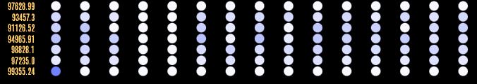
Ready to Go!
Just like that, a beautiful and functional React Heatmap Chart, customized to match our existing app—in less than 50 lines of code, including the imports and component boilerplate. Now that’s what I call efficient! You can customize literally any part of the chart—the sky is truly the limit, as you can see by how different this Heatmap chart looks from the examples in the documentation!
If you want to check it out yourself, you can play with this (less styled) StackBlitz demo, or explore the full LKARS demo app to see a more complete example. And, of course, feel free to explore all the other wonderful charting options mentioned above. You can see all their rich functionality and even access award-winning technical support during the free 30-day KendoReact trial.
Continue on Kathryn’s LKARS voyage with Sorting, Filtering and Grouping With the KendoReact Data Grid and How To Use and Customize the KendoReact DatePicker.

Kathryn Grayson Nanz
Kathryn Grayson Nanz is a developer advocate at Progress with a passion for React, UI and design and sharing with the community. She started her career as a graphic designer and was told by her Creative Director to never let anyone find out she could code because she’d be stuck doing it forever. She ignored his warning and has never been happier. You can find her writing, blogging, streaming and tweeting about React, design, UI and more. You can find her at @kathryngrayson on Twitter.
Related Posts
Comments
All articles
Topics

Latest Stories
in Your Inbox
Subscribe to be the first to get our expert-written articles and tutorials for developers!
All fields are required